

A conversation with the Oscar®-nominated production designer of The King’s Speech
Sitting down with British production designer Eve Stewart is more like taking tea with an old friend than conducting a formal interview. Armed with an affable personality and a natural propensity for storytelling, it’s easy to see why directors like Mike Leigh and Tom Hooper keep hiring her. Stewart recently earned her second Oscar nomination and third BAFTA nomination for her work on Hooper’s The King’s Speech. Past credits include Guy Ritchie’s Revolver (2005), her BAFTA-nominated production design for Vera Drake (2004) and Topsy-Turvy (1999), for which Stewart shared an Oscar nomination for Best Art Direction/Set Decoration with John Bush). The art school graduate says she’s influenced by theatrical designers and is a big fan of “outsider art.” “I met a woman who was very sick and had been most of her life,” Stewart recalled. “She sat in bed and embroidered, within arm’s reach, with everything she knew and dreamed about. It was like someone’s soul in a crescent shape. Dreams in little stitches.” Within the film industry, Stewart admires Dante Ferretti and John Box, adding that in her own designs, she can get caught up in telling the truth sometimes, when what she needs to do is “just let the poetry of the thing take me on a great surge of joy.” Margot Carmichael Lester chatted with the two-time Oscar nominee about her prime creative relationships on the set – cinematographers and directors – and how she was able to surf that self-described “surge of creative joy” in her designs for The King’s Speech, set in 1930s London.

ICG: The director, DP and PD is often the most important creative triangle in moviemaking – does it vary from picture to picture and is it always dependent on the director’s vision? Eve Stewart: It’s different, but always keyed to the director’s vision. I’m usually hired before the DoP, and when he or she comes on, it becomes a triumvirate. The DoP is very influential. It’s a subtle relationship – a bit like a spider dance. You wander around each other till you know what makes the other one excited and what visual references you can both engage on. It’s quite intricate: [Cinematographers and production designers] have to feed into each other and offer the things that each needs. The technical ability of the DoP is often enhanced by very creative influences of color and talents offered by the production designer. I get excited by that. I used to do theatre and opera. So I feed on collaboration and love it when all ideas are there in a great big soup. The director can then become the arbiter of decisions. Sometimes [cinematographers] assume that designers have limitations related to budget or scope. It’s frustrating when they don’t believe what we can do, how cunningly we can dress a set within a small budget. Instead of rejecting ideas out of hand, they can be thinking more left field.
If you could give one piece of advice for making that relationship successful for younger DPs coming up, what would it be to? Just know that the production designer is completely on their side and has a true desire in their souls to illustrate stories.

How did you get involved in The King’s Speech? [Director Tom Hooper] and I have worked together before and we get on very well. We complement each other because we both like to explore the emotions of characters visually as well through the actors. We’re lovers of telling tales – the dark art of European storytelling.
How did you work with the Tom and DP Danny Cohen? I worked mainly with Tom in preproduction because we’re close and geeky about making sure things are right. I do a lot of illustrations and big scrap books for Tom. He’s very tall and leggy and I’m quite short. He strides off like a commanding general and I run after him like a beetle with a large book of references and shots. He’d call, “What are we doing here?” and there I’d be to show him with the book. We did incredible amounts of research. I even made friends with a former Queen’s Equerry to learn about many things related to the abdication and the coronation, even including what position pens would be in, who would nod or bow or go out the door first. I’m a great lover of practical lighting and Tom and Danny were keen on sources being real and not contrived. We used original lamps and old light bulbs still being made in Poland with right elements so they didn’t look modern at all.
Is it harder to design a movie that takes place in such a well-documented time and place? It’s easy for references, absolutely, but also very tricky given that so many people want to give their penny’s worth. There are always loads of old girls saying, “Oh, no. You’d never have a tea pot like that.” There’s a group of ladies here in England called the Lamp Spotters. They watch period films and if you make a mistake, they’ll write to you with a barrage of insults. I’m really scared of getting a letter! On this film, we had to make quite a lot of the broadcast equipment, though we did find some good sections of original pieces. Luckily, there’s a horde of old enthusiasts in the countryside who collect this stuff, so it was a combination of constant dogged determination to find items and to replicate ones we couldn’t get. There are a lot of close-ups of dials. We made lots of those ourselves using muffin cases filled with plaster and paint.

What were your references and inspirations on this film? My whole family is from London, so I grew up being told great stories of the city in that period. I remember tales told by my nana and great aunt. They used to wind the sirens on the roof in the East End when the bombs came. I learned about the time in old songs or a story-telling way. People were much less material. Life was so much more about relationships and being close. We very much wanted to show that with the Royal Family. There wasn’t a lot of money about. Everyone just made do, including the Royals. They didn’t always want to be flashy. It was much more about your position and your duty.
The film starts out dimly lit and foggy and gradually becomes brighter and more saturated. How did you make that choice with regard to set and location dressings? We wanted to show that when the Yorks are first seen, it’s clear they’re not directly in line for the throne. They’re much more like a normal family. They were put out in one of the favored and great houses but nobody took great notice of them. So the changing light shows a journey from being kind of on the outskirts of the Royal Family to Bertie’s realizing he has to up his game because he’s in the public eye.
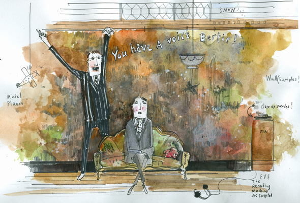
Logue’s office was the only “bright spot” in the early scenes, contrasted by the dank waiting area. Why did you decide to do that? The film needed opening up at that point as Bertie’s world was opening, too. This character Logue is quite theatrical, down to some of his larger-than-life techniques. The room fed that. The place seemed like a beautiful garage where great ideas and notions are born. The skylights signified their being looked down on by eyes of the world. Textures were really important to show the layers of people who’d been there before. We found a section of wall with those layers on it and fell so in love with it that we put it all over. It showed the stripping back of a person’s emotional baggage. I have a right old carnival gang of ancient painters who painted on old films. They know so many techniques. They’re truly artists who’d stay all night doing layers of lacquers, paints and papers.

Do you have a favorite scene? It’s when Bertie and Logue go into the cupboard for the final speech. That venue, Lancaster House, is one of the biggest in London and it was our most expensive location. We painstakingly kitted out all those rooms they walk through so fast! It’s a good laugh when they head for the tiny cupboard at the back. They really did do the broadcast from a small room; they were gathering up fabrics and hanging on the walls so the sound would be better for his soft, small voice. I also loved the scene with the toy horses. I’d read in a book, written by the princesses’ old nanny, that the princesses would put all their toy horses to bed every night. They got up to about 60 horses, and it could take two hours to do the nosebags and prepare the stables. I like including those tiny details. People relate to them personally. It makes the characters’ world real.
What else should our readers know about the production design of The King’s Speech? It wasn’t just me. I’m at the forward phalanx of a great [art department] gang of hairy old dogs with enormous skills, big hearts and real drive to make things beautiful and right. Hardly any are trained in film – I’ve known most of them since art school. They, like the work itself, are precious to me.